Blurring the Lines

I’ve been doing a lot of motion blur lately while out walking or waiting for the bus. This crossing gets a lot of traffic at the top of the hour, but I have hitherto preferred to capture a few people crossing rather than the great mass of pedestrians.

Passing

Bikes and cars both offer longer lines at the (relatively) fast shutter speeds I use when handholding my X100:

Dead Heat

I can reliably handhold the X100 down to about 1/8 second, if I tuck my elbows, hold my breath after exhaling, and don’t mash the shutter. As a friend of mine described it, it’s like fusing video with still photography: the motion is clearly expressed against a sharp background.

Stormy Weather

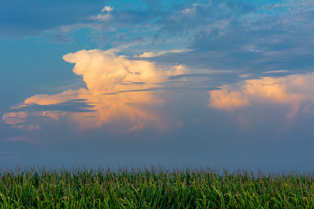
My best man’s son, who lives in Denver, got married in July, and I wanted to give him and his bride a framed print as a wedding present. I wanted to use the occasion as a spur to make a landscape image, and I wanted something that said “Illinois”; the idea of a thunderhead looming over a cornfield was the obvious way of satisfying both conditions.

August Thunderstorm, Champaign County, IL

This rather simple-looking image was anything but simple to assemble. Since I don’t own a camera or lens capable of tilt/shift movements, I could not carry focus simultaneously in the corn and clouds; an in-focus exposure had to be made for each one separately. The corn was also much lower-valued than the sky, so the corn-focus exposure would need to be “developed” accordingly, and it was windy on the evening I took the picture, so the silhouette of the corn did not match between the cloud-focus and corn-focus exposures.

I could not get sharp detailed corn cleanly bordering on sharp detailed sky in Lightroom alone. Layering two TIFFs, one “developed” from each candidate exposure, yielded masking and gradient artifacts on the lower cloud and corn edge. Ultimately, I had to layer three TIFFs:

  • The sky-focus exposure
  • A copy of the corn-focus exposure “developed” identically to the sky-focus exposure
  • A second copy of the corn-focus exposure “developed” for the corn

Using my trusty Wacom tablet in the GIMP, I then had to manually mask in the edge of the corn with a small soft-edged brush, taking care to leave no edge artifacts. This may be the single most tedious task I have ever undertaken. To prevent eye and hand strain, I had to break it up into multiple small chunks over the course of a few days rather than go for it in one marathon session. I consider the labor and patience well spent, though, as the result is far superior to any other method I attempted.

Many people say that rural Illinois is boring. Subtle it may be, but boring it is not, and I only wish I had more time to go out and make images that justify my opinion. Consider this one small step in that direction.

Shooting on Velvet

It’s been a little while since I wrote about portraits, and wouldn’t you know, I have a couple recent ones.

Six

I make at least one portrait of my children every year, as close to their birthdays as possible. “As close as possible” was almost three weeks afterward this year for my older son, pictured above, because of paternal inertia. The delay had its benefits, though; I was able to mentally discard several unnecessarily complex ideas in favor of something simple and attractive. A secondary goal was to create something that would look good both in monochrome and color.

We have here a variation on my favorite two-light setup, with a large soft key (the 60″ Photek Softlighter) balanced by a harder separation light, with a pure black background. The separation light is warmed both with a 1/4 CTS gel and by setting flash white balance rather than daylight. The key light’s color is unmodified.

Normally, I use a bare speedlight for separation, but this time I wanted a slightly softer edge to the separation transfer, so I strapped a LumiQuest SoftBox III to the front of my strobe. I’m extremely pleased with the result; so pleased, in fact, that I’m inclined to use the SoftBox in preference to a bare strobe from here on out, unless I absolutely need the harder edge.

Really, Now

My younger son wanted in on the action too, of course. I made things easier for both of them by using gaffer’s tape to mark where they should stand on the floor, something which I’ve never done before but should have been doing all along.

The background is a piece of black velvet curtain which I bought from a local hobby store, attached to and draped over a tall bookshelf. Since it’s supposed to be pure, textureless black, I was able to push the contrast a little harder in these images than I would have otherwise, resulting in a palette of tones I really like. I haven’t shared the monochrome versions in deference to my mother, who prefers color portraits of her grandsons, but the B&W conversion is every bit as pretty as the originals.

Rocket Glare

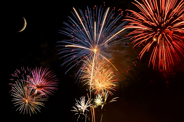
The technical side of fireworks photography is easy and repeatable: low ISO, small aperture, infinity focus, bulb shutter, remote shutter release. The artistic side is much harder; one must find the right location and angle, and time the shutter to get the optimal part of the explosion. One also depends on the skill and imagination (or lack thereof) shown by the pyrotechnicists.

The fireworks people who do the annual Independence Day show in Champaign always seem to send their rockets up into exactly the same part of the sky, so I’ve begun shooting individual bursts and making composite images in post. Here’s July 4, 2011, viewed from the back patio of a friend’s house:

Pretty Boomy Things

In 2012 I was at the same friend’s house but didn’t get the composite I wanted out of that session, and in 2013 I had to stay home during the show.

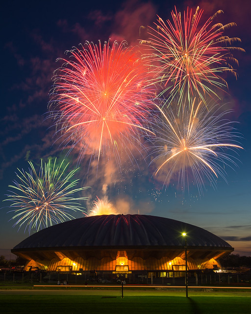
This year, I was finally able to shoot from the east side of Assembly Hall:

Pretty Boomy Things II

Without the twilight behind to define Assembly Hall’s silhouette, I could not have made this picture. I haven’t given much thought to 2015 yet, but I know that I don’t want to repeat myself.

Two Portraits

I don’t do nearly as many portraits with added light as I used to, which means I’m not as fluent as I’d like and it takes me longer to set things up when the mood strikes. Part of that is aesthetic, too; I like to change the color of my lights, and finding the right look may take a bit of thought. Here are two relatively recent portraits with added light.

Deadly Cute

I was flabbergasted when my son not only let his face be painted at a carnival, but enjoyed it. A picture had to be taken. By the time we got home, my back yard was in full twilight shade, and I seized upon a warm/cool color contrast for the image. The key light was diffused with a shoot-through umbrella and had its color shifted with a CTO (Color Temperature Orange) gel. Temperature and mood are inverses of each other, of course: blue is high temperature but “cool” in mood, while orange is low temperature but “warm” in mood. By using the CTO and setting a manual white balance, I could warm the light on my son while shifting the ambient to a pleasing blue, suggestive of the time of day.

Untitled

For Christmas, my sister-in-law had given my wife a hairstyling device to ease the production of hair buns, and when she tried it out one morning her silhouette screamed “this needs a mantilla.”

Here we see a slight modification of my favorite color portrait look: low-saturation green fill with a hard warm key. As previously discussed, greening up the fill light (1/2 Plusgreen, in this case) prevents the shadowed skin from going magenta, while a warm key (1/4 Color Temperature Straw, a less-red version of CTO) establishes a reference skin tone that is subconsciously applied to the shadow areas as well. In this image, the color combination is also evocative of older color negative film, an appropriate choice for the subject as attired.

I have not yet moved beyond the “bag of tricks” method for controlling color in my portraits. It’s OK for now, but I want to develop more mastery over the medium, so as to let the nature of the subject determine what colors should be used.

Willowy Lava

On the same trip to the Chicago ‘burbs where I enjoyed a bit of planespotting, we took the kids to play one afternoon at a connected chain of parks along Salt Creek in Rolling Meadows. I was given a furlough to split off and take pictures, and happened upon a gnarled old willow tree with some really interesting stuff going on in its bark.

Untitled

There’s something here that reminds me of a pāhoehoe flow overwhelming a higher dike or ridge of rock. I’m not entirely satisfied with my control of depth-of-field in this image, and I hope to go back sometime and try again…maybe with a rented tilt-shift lens?

Lazy, Hazy, Crazy

Summer may be the university’s slow season, but that doesn’t mean a few students aren’t around. Some of those who study take advantage of the warmer weather to sit under a tree while doing so:

Summer Session

Stealth was essential to getting this shot. As usual, I was carrying my X100, so I had to get in close to make the foreground student big enough, while keeping enough distance not to spook him. At original resolution there was just a little too much foreground for comfort; changing from 3:2 to 16:9 solved that problem. A host of tweaks then followed: reduced saturation and a couple slight color shifts, vignette, dodging the foreground student to bring more attention to him, and cloning out a couple extraneous elements on the edges. More than I normally do, for sure, but this image is as much about the surroundings as it is about the student. The details are everything.

Drinking Remembrance

I wanted to scan and publish a picture of my dad when he was in the Air Force as my tribute for Memorial Day, but that was impossible for technical reasons. Instead, here’s a drink I raised this evening to my dad, my great-uncle, and everyone else who has served the United States in uniform:

Untitled

The drink is my variant of one of the few decent blue tropicals: tequila, lime, orgeat, maraschino, Cointreau, and a drop of blue food dye. The light is an interesting mix I’ve never tried before: tungsten ambient, with an ungelled flash held by my wife to make the glass glow a little bit, processed with tungsten white balance. The ungelled flash was a deliberate choice, as I knew the tungsten white balance would render it bluish — perfect for emphasizing the color of the cocktail.

In the Flow

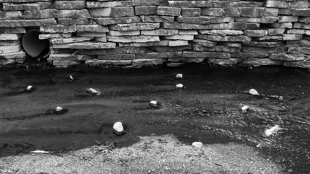
I went out for a stroll at lunch late last week and walked down to the Boneyard Creek behind the Everitt Lab machine shop:

20130516-DSCF4736

The rocks in the stream caught my eye here. When I reviewed this exposure on-camera at the end of the day, I was not impressed, but I let it sit for another couple days before reviewing it on my computer, at which point I saw that cropping from 3:2 to 16:9 would eliminate an anomalous bright reflection and improve the image. Some basic lens correction, tonal adjustments, and sharpening were quickly applied, but there wasn’t enough local contrast; the water and rocks did not have enough separation. I was feeling stymied and about to give up when it hit me: gee, why don’t you burn in the water, dummy? Photoshop not needed; Lightroom’s Adjustment Brush did exactly what I wanted. I might further tweak the dry tops of the rocks; as it is, they have subtle high-value gradations that could need help to print well.

I haven’t decided if the rocks are more interesting by themselves or in the full context of the channel with landscaped banks. I may go back for another try with a different lens.